THE PARTICIPATION GAP: WHY URBAN DESIGN DECISIONS MISS 80% OF COMMUNITY VOICE?
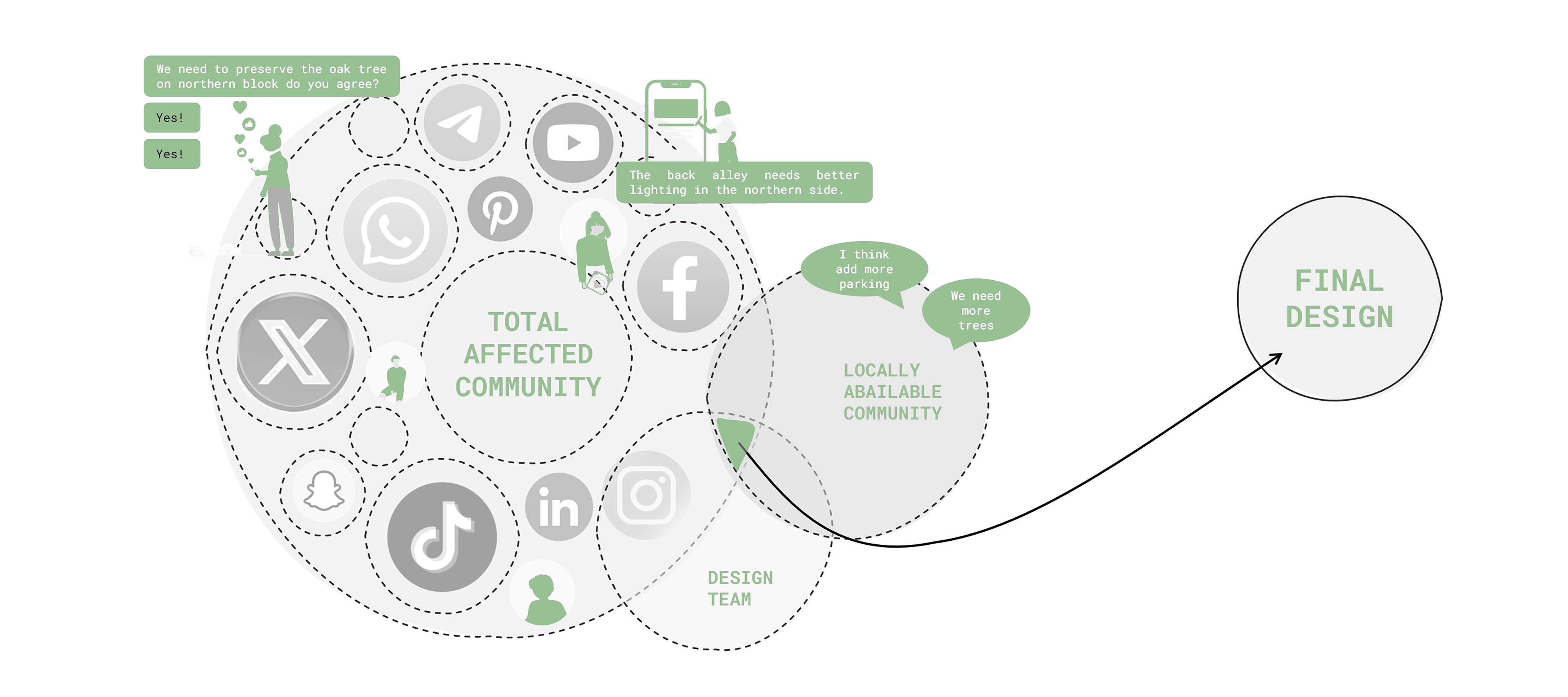
But often during this review from stakeholders a large amount of community is left out of the context due to the lack of availability. This lack of availability causes a gap where designers cannot access all the opinions of people.
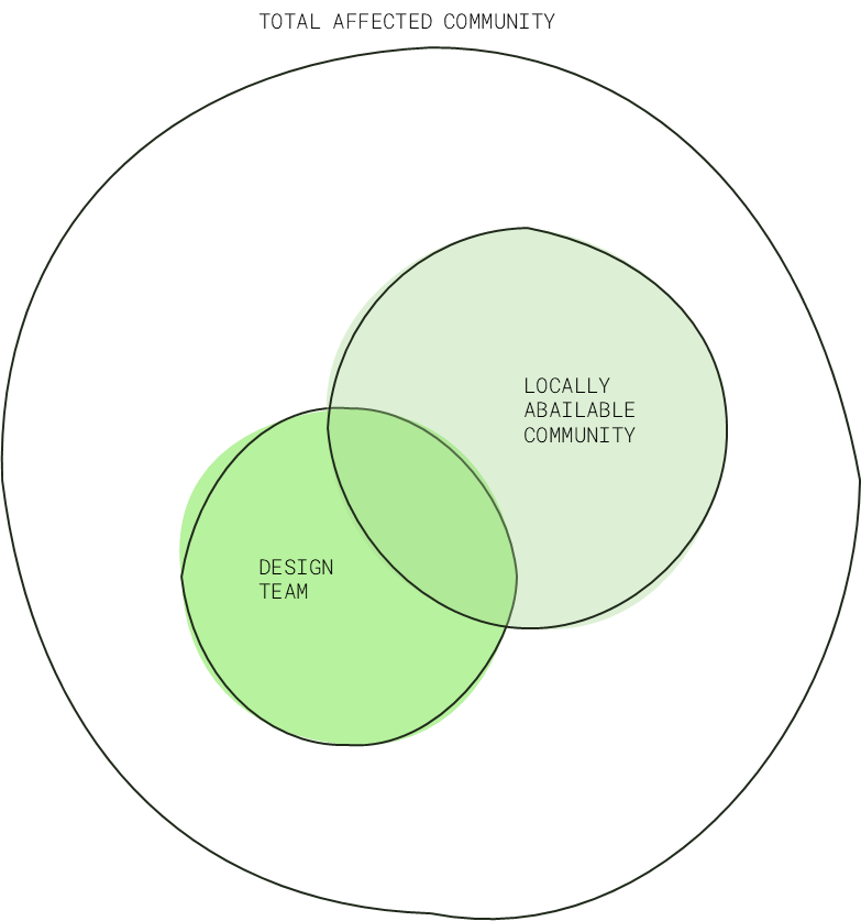
Map of participation gap
Considering that the amount of people who are missed out from the interaction and review for the stakeholder review - there is a need of using a tool that can act as the voice of the community. And that tool in todays age is: Social Media. People can comment their views/experiences/opinions on different platforms about different spaces. These comments can serve as the basis of design solutions for the designers where the users themselves direct solutions/target issues of spaces.
"Cities collect traffic data, pollution data, economic data. What if we collected emotional data? What would cities designed for joy, not just efficiency, look like?"
Backend Logic
One of the first measure is to scrape through the internet extracting comments, posts and opinions people have posted on any platform for that particular space. The scraped comments are then analyzed and categorized to formulate an informed design solution. That can help in generating a design solution that is in direct alignment to the issues specified by the masses - unfiltered and direct.
- NLP filtering, Social media filtering Generative AI
Frontend Logic
The UI interface is intended to be majorly used by designers. The dashboard to be conviction of major metrics which completely covers the pipeline. From scraped comments - NLP - Geotagged location specific Solutions - imaged through generative AI.
- Design solutions, Scraped Comments, Design Proposals
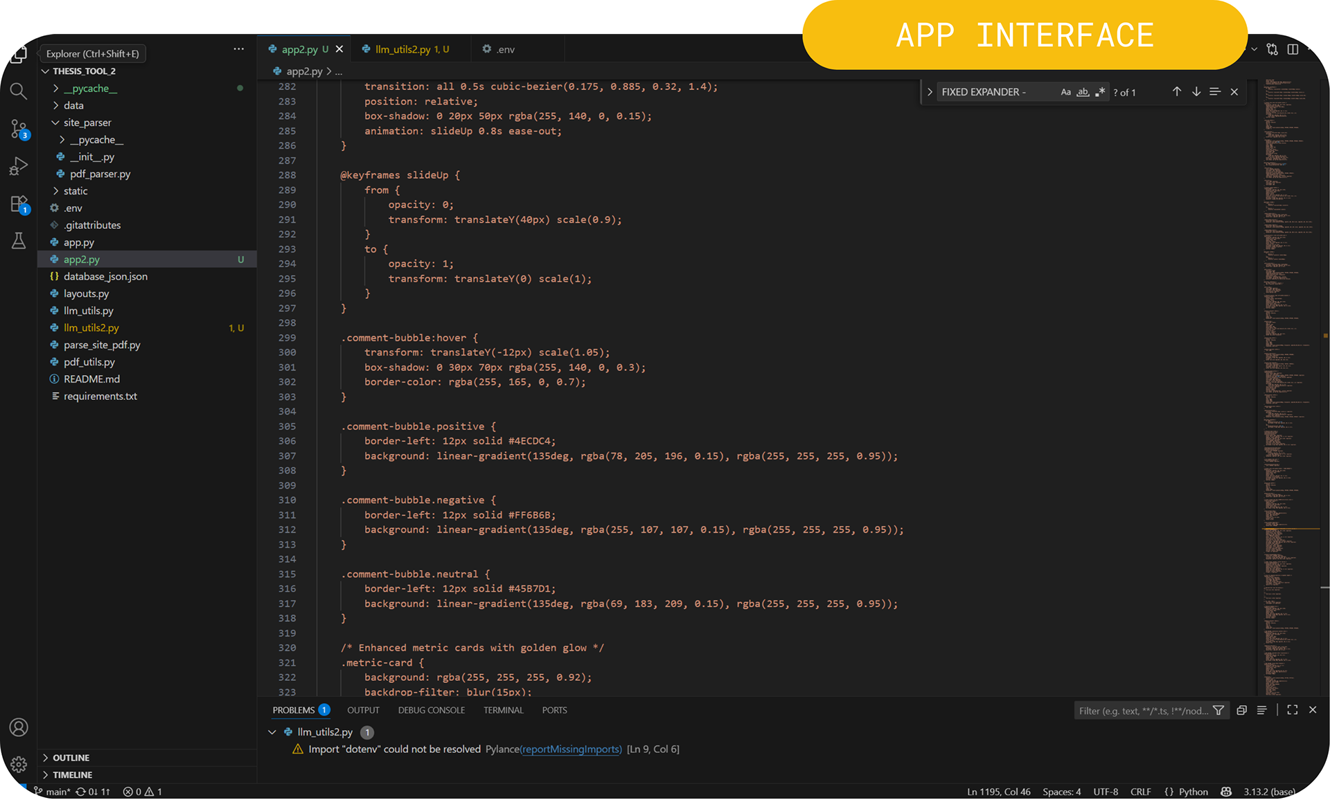
App Interface
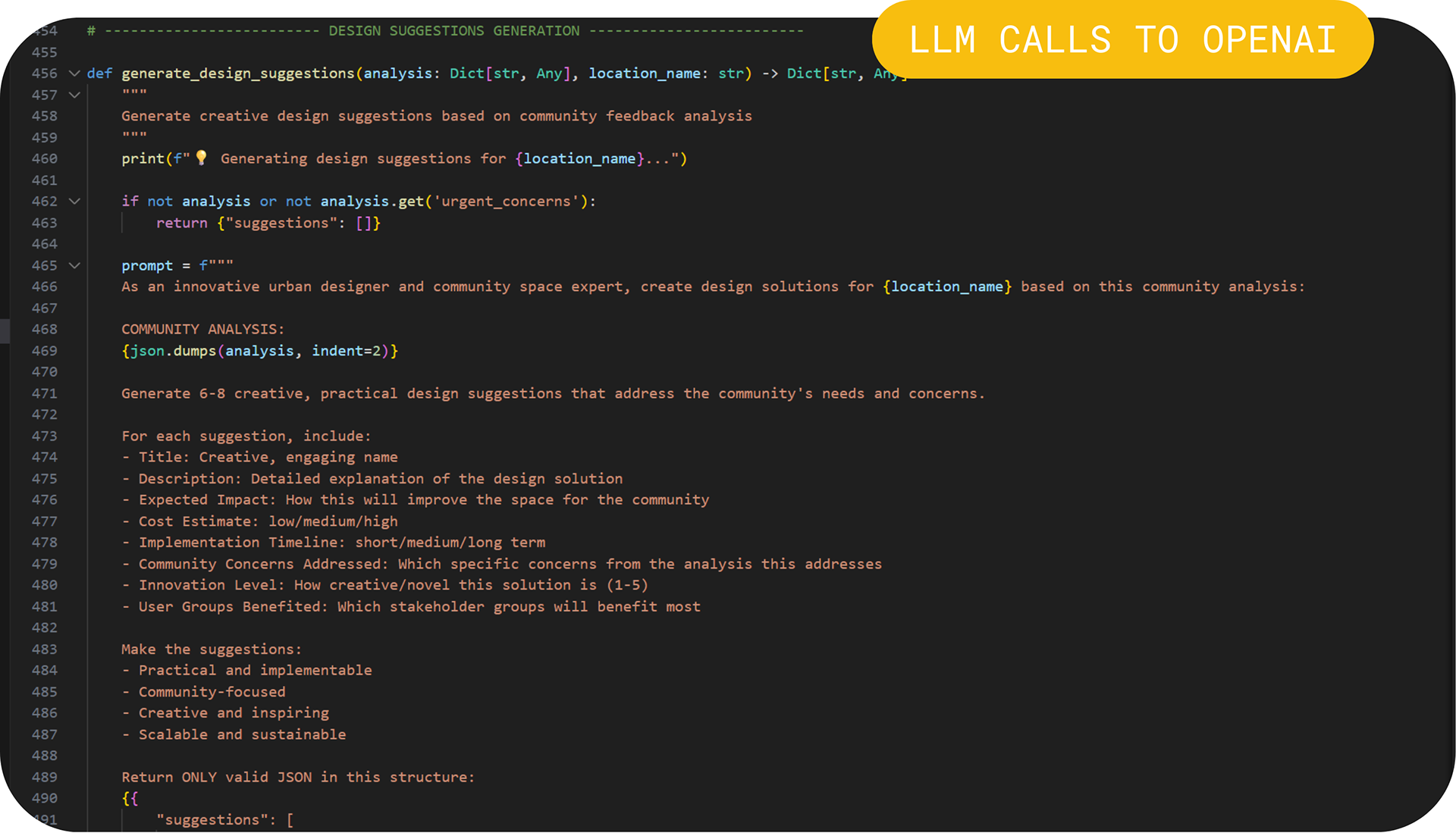
OpenAI API calls
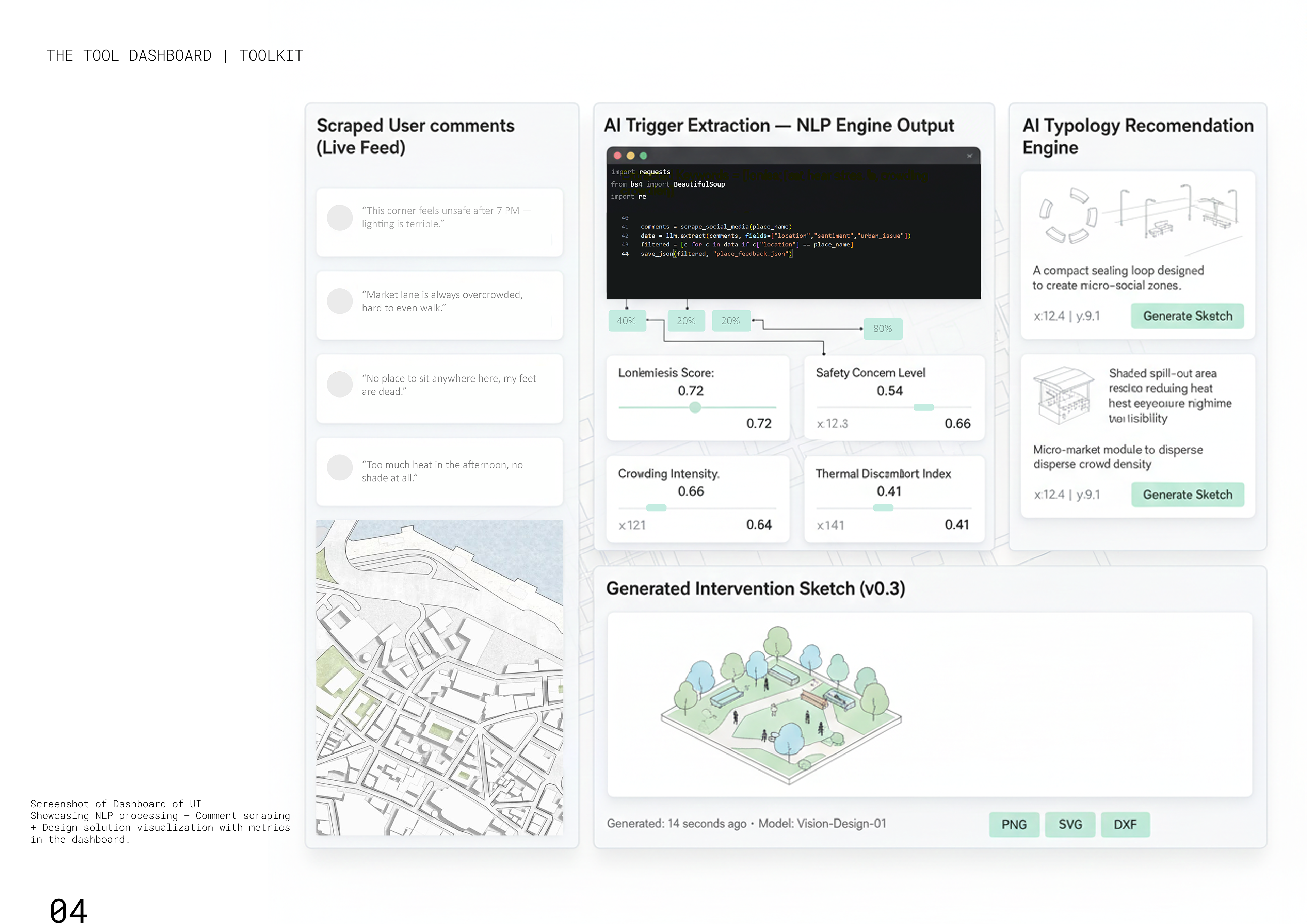
THE DASHBOARD
The dashboard is intended to be a intelligent monitor which measures all the major transformation parameters of the urban space. Covering the complete design pipeline:
scraping the user comments - trigger extraction > scoring > design solution extraction > design solution visualization
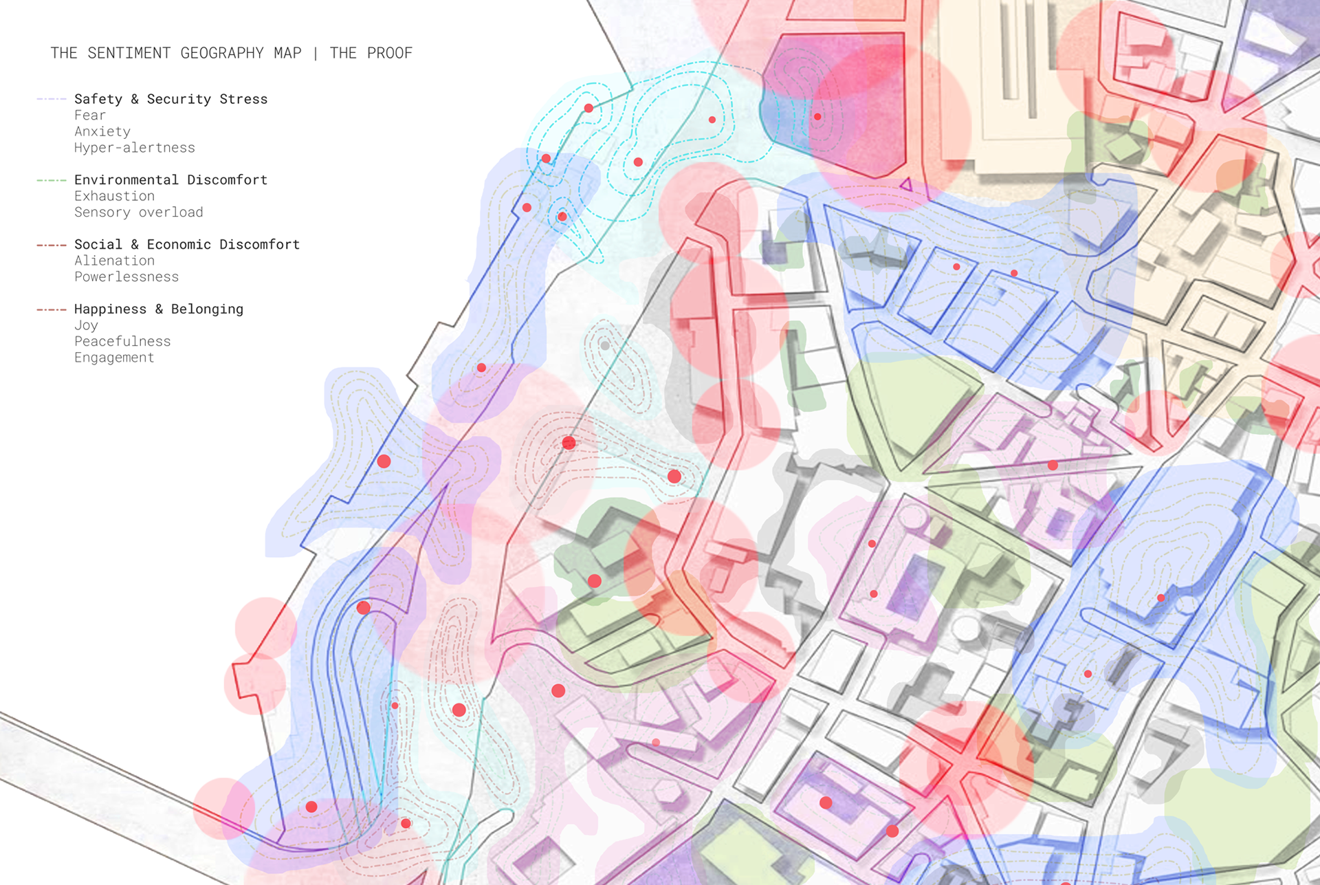
EMOTION HEAT MAP
Based on the scraped and comments of social media it has been analyzed where all these comments are converted into specific map that is projected emotions shown as colors to the particular geo locations. Showcasing a multilayered map that helps in visualizations of design interventions and areas of concern. Bringing a subjective matrix into measurable metric.
The Process Steps
To explain the project this step by step user experience of the tool will help in giving a clear overview as to how the project unfolds. Each step aimed towards a specific target in the completion of the design pipeline.
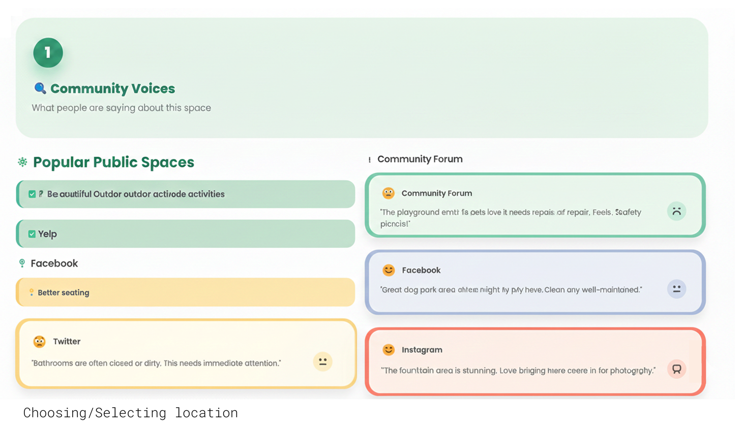
Step 1
Users select a particular location. Which then is scraped across the internet using keyword searches for similar comments/posts.
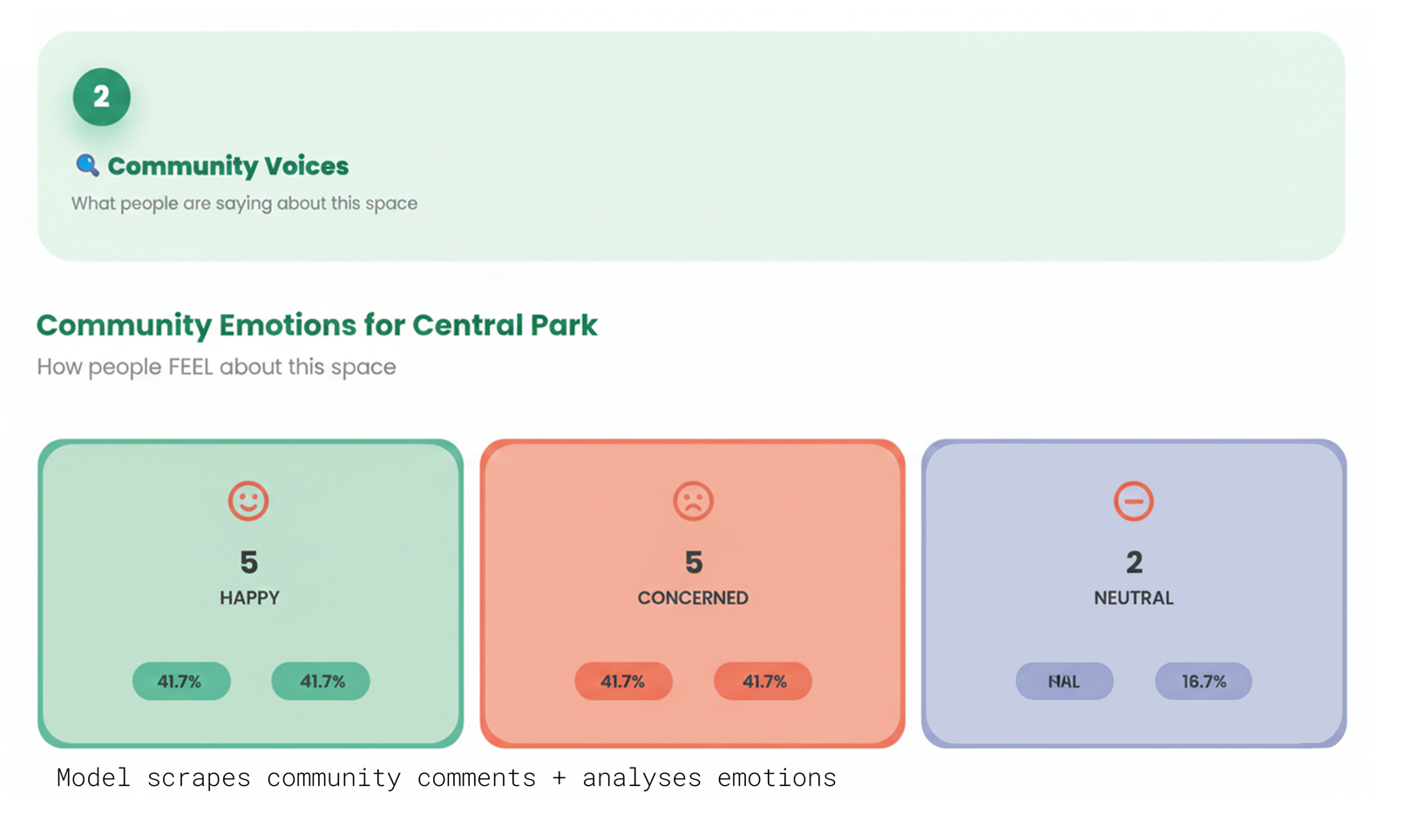
Step 2
Post scraping - the social media comments are analyzed and categorized into emotional mapping. To establish connection between these emotions & comments - to formulate which design comments to consider.
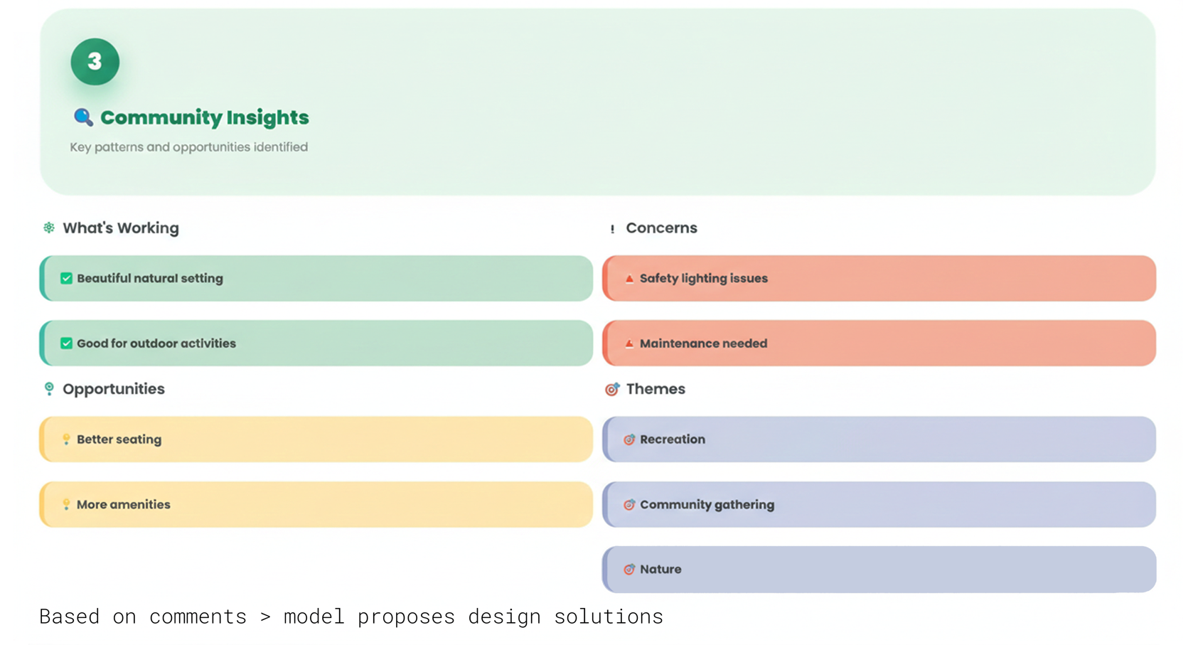
Step 3
Now the improvements are expanded beyond just expressions. Bringing the intangible into tangible - proposing design solutions.
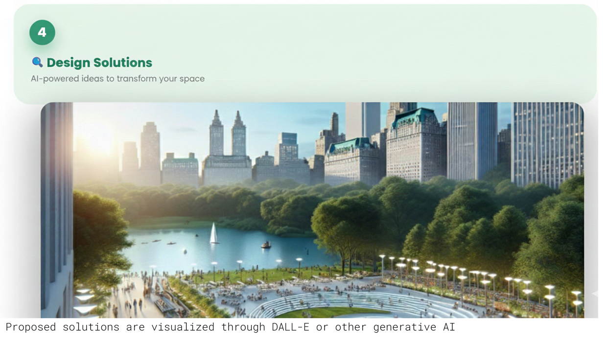
Step 4
Design solutions are visualized using generative ai models like stable diffusion/SDXL. These solutions help in solution visualization for better intervention execution.
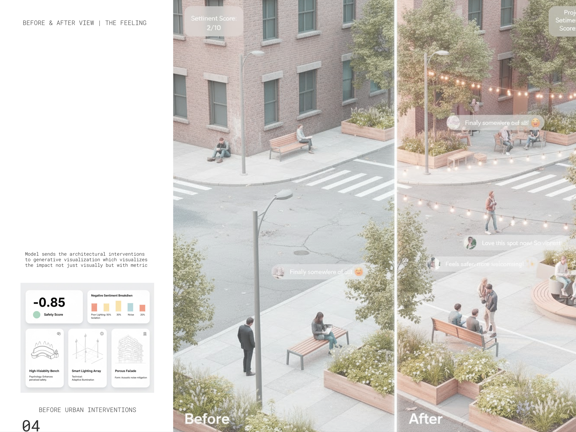
Impact
To know if the system actually works - a pipeline has been set up that will help analyze the impact of the generated solutions. Before and after of the same location is visualized through generative AI solutions that help 'see the impact' than just imagine it.